Category: Collecting · Reading time: 3 min
The most common mistake people make when buying an abstract print is choosing it for the sofa.
You know the impulse. You have a grey sofa and you want something with a little warmth, so you find yourself drawn to the oranges and terracottas. Or you have a white wall and you want impact, so you reach for the darkest, most dramatic work in the collection. These are understandable instincts. They are also, almost always, the wrong ones.
The best abstract art does not match your room. It speaks to it — and sometimes argues with it.
Start with feeling, not colour
Before you think about where a print will hang, spend time with the work itself. What does it make you feel? Not what does it remind you of, not what does it go with — what does it make you feel? Abstract art operates at a level below narrative. It bypasses the part of the brain that wants to explain things and goes straight to the part that simply responds.
If a work makes you feel something — curiosity, unease, exhilaration, calm — that is the work for you. Colour co-ordination is secondary. The feeling is primary.
Scale matters more than you think
A print that looks bold on a screen can disappear on a wall. As a general rule, go larger than you think you need. An A1 print (59 × 84cm) that feels ambitious in the shop becomes, once hung, exactly right. An A3 that feels safe becomes, once hung, a little lost.
If you are unsure, hold a piece of paper the size of your intended print against the wall and live with it for a day. Your instinct will tell you quickly whether it needs to be bigger.
Give it room to breathe
Abstract work needs space around it. Resist the temptation to cluster prints together or hang them in busy corners. A single strong work on a plain wall, with nothing competing for attention on either side, will always outperform a gallery wall of smaller pieces.
The wall colour matters less than the breathing room. White walls are classic for a reason, but deep navy, slate grey or warm plaster tones can be equally powerful — sometimes more so, as they push the work forward rather than simply displaying it.
Light it properly
If you do one thing after hanging your print, install a picture light or a directional spot above it. The difference between a print lit well and a print lit by overhead ceiling lights is the difference between a gallery and a corridor.
Warm light (2700–3000K) brings out the depth in textural work. It is worth the effort.
Trust the work
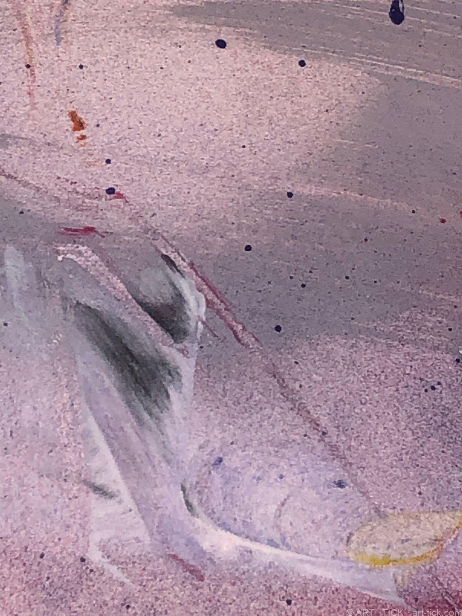
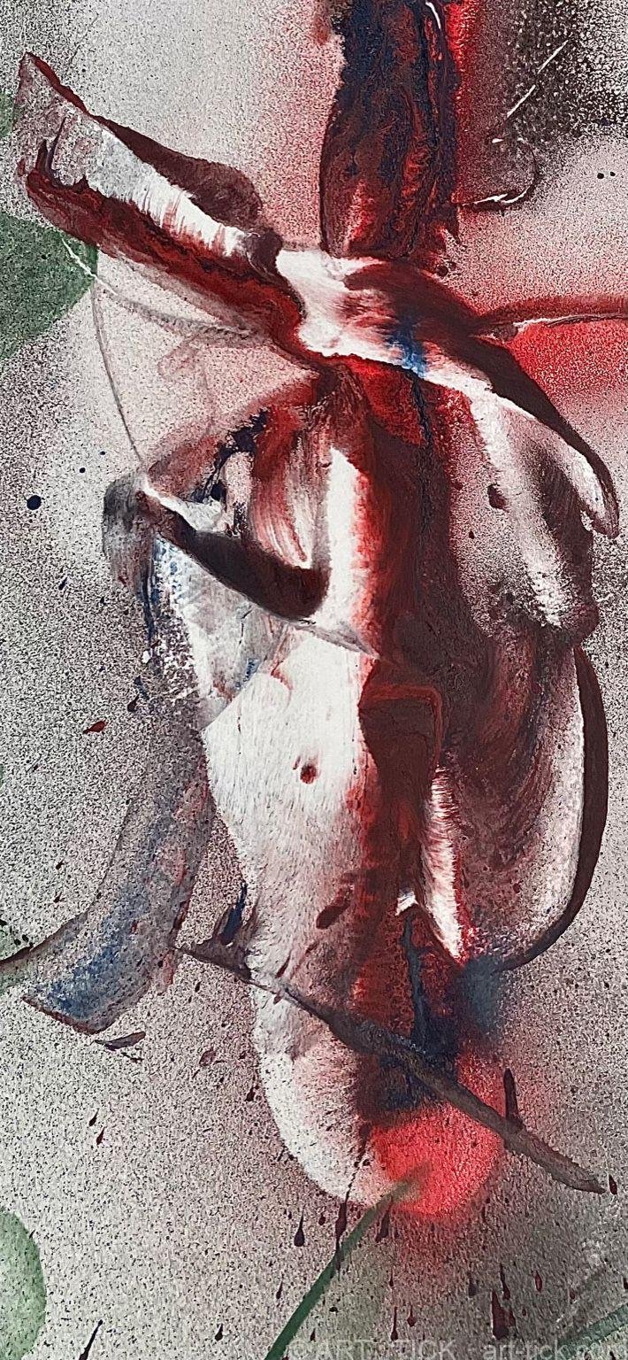
Abstract prints from Wedgo’s collection are not decorative objects in the conventional sense. They are records of specific moments — afternoons in the Languedoc heat when paint moved faster than intention, when accident became decision, when the work found its own form.
They will do the same in your home. Give them a wall, give them light, and trust them to do the rest.
— Studio Notes, art-tick.com